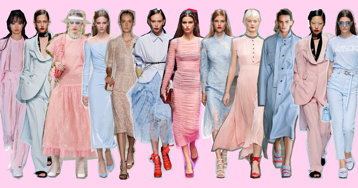
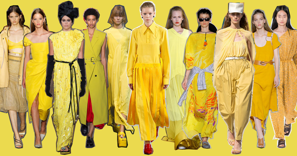
Straight from the Pantone Fashion Color Report, here is the list of the trendiest and most popular color trends that we’ve seen on the Spring/Summer 2018 runways, including my tips on how to wear them. Generally speaking, color trends can be split into two “factions”: for those who are fond of vivid colors, an intense color palette evoking Fauvist paintings; on the other side, pastel shades for light and romantic outfits.
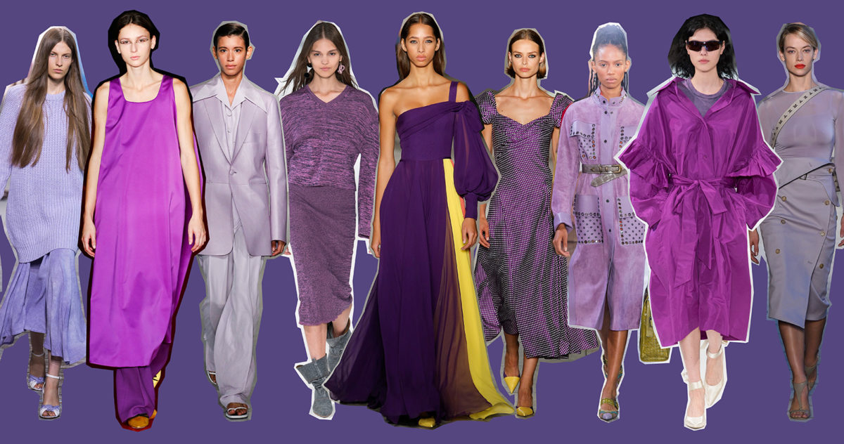
We will be wearing Cherry Tomato red and Lime Punch neon yellow, but also pastel and very feminine nuances such as Blooming Dahlia peach pink and Pink Lavender lilac, as well as retro sixties-style tones like Arcadia blue-green and Little Boy Blue. The latest from the summer color palette are Emperador brown, a mix of chestnut and chocolate brown, super sophisticated, and Ultra Violet purple, the season’s sexiest color.
How to pair them? If you want to be sure not to fail, just rely on the cold color + warm color combination or put on as much layers of candy colors as you can: peach, lilac, lavender, blue-green…
Purple
Yellow
Red

Brown

Arcadia Green

Pastel tones
Almost Mauve
“Almost Mauve” is actually a powder pink tone verging on ivory. It pairs perfectly with nearly all the colors on the palette, but the chicest result is achieved with salmon pink or red.
Little boy Blue
Very seventies-style, it inspires peace, calm, serenity, only the good things. If you mix it with white, you’re instantly catapulted into summer: the color of children’s clothes, of starched pinafores in a garden in full bloom.

